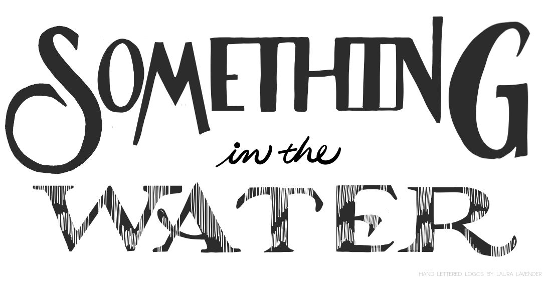
Hand drawn Logo - something in the water
Here is two versions of the logo design I created for a soon to be released documentary..... with a strong focus on water! I thought the watery looking text really added a ‘je-ne-sails-quoi’
THIS VERSION OF THE LOGO HAD A GENTLER, LESS ANGULAR SHAPE TO THE ‘S’, WHICH BALANCED OUT THE DESIGN.
THE FINAL DESIGN FEATURED COTTON FLOWERS AND BUDS, AS A NOD TO THE MISSISSIPPI LOCATION OF THE DOCUMENTARY.


