Copperplate or Spencerian Calligraphy?
The word “Calligraphy” means “beautiful writing" in Greek. Are you interested in easily telling the difference between the beautiful writing of “Spencerian” and “Copperplate ?"
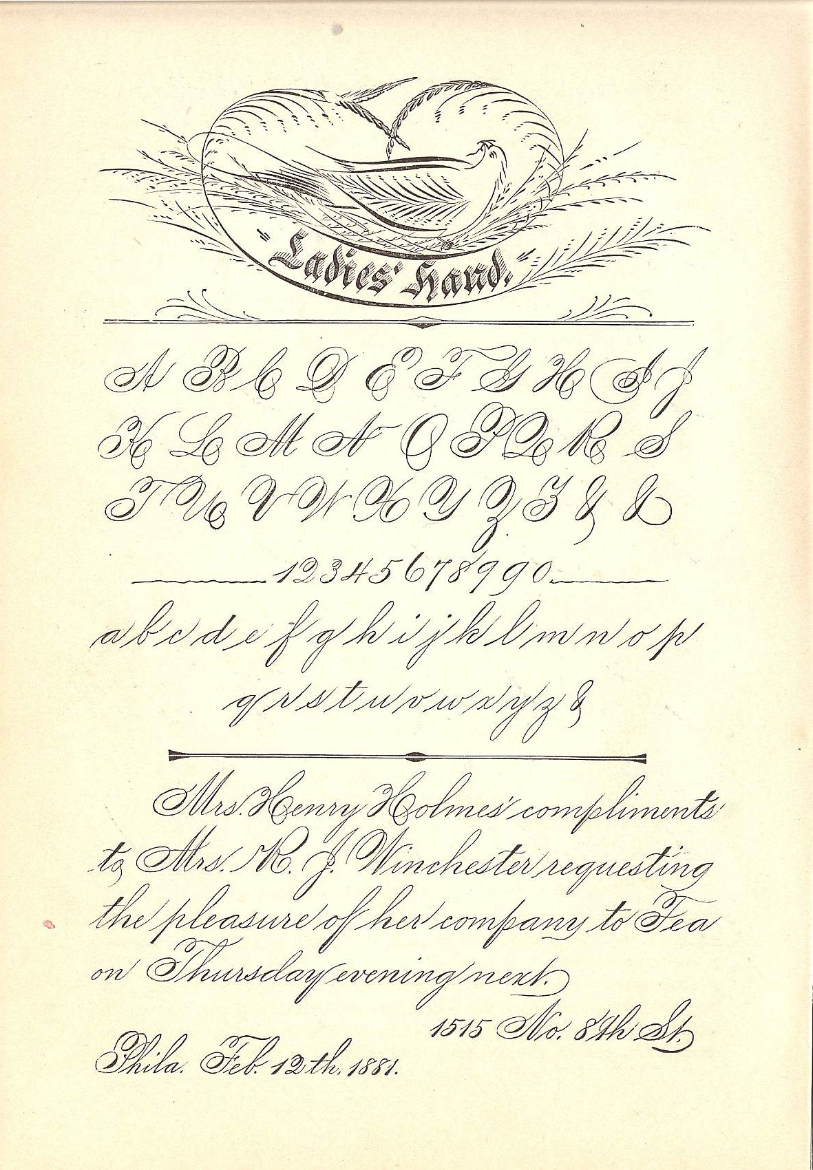
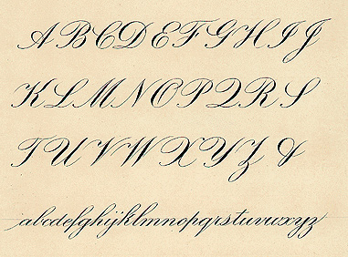
Here are two historical exemplars of each alphabet, from which we can see the difference.
Spencerian is recognized by its "light" lower case letters (the majority of the lower case letters do not have a lot of shading. “Shading” refers to the heavier thick parts of the letters where the pen is given pressure and therefore more ink!).
Copperplate letters are written with more shades (darker, heavier lines where the pen swells).
Let’s look at the lowercase letter m. I’ll show some samples from my upcoming book on traditional calligraphy. (2022)
Here the Spencerian letter ‘m’ is shown with its sister letters ‘n’ and ‘x.’ Notice the similarities between the formation of these letters.
If we look at the lowercase letter “m”, we can see that the Spencerian letter ‘m’ above has very little stroke difference as the letter progresses: it is very nearly the same width throughout.
If we then look at the copperplate minuscule letter “m” shown below, we can see the thick downstrokes. The copperplate lower case m is shaded on all its diagonal downward strokes.
Copperplate minuscules: letter ‘m’ is shown with its sister letters ‘n’ and ‘x.’ Compare these letters to the spencerian ones above.


